Re-launch of the website

After much deliberation, we have decided to redesign our website. It should be reduced and at the same time convey a good impression of who we are and what we do.

T

he time has come: after much deliberation, we have decided to redesign our website. It should be minimalist, highlight the essentials and at the same time convey a good impression of who we are and what we do. We wanted to base the design language on the previous website and stay true to its color scheme, but without missing the opportunity to overhaul aspects of the typography and imagery. In fact, we quickly came to the conclusion that a few occasional changes would not necessarily be effective in the long term, which is why we not only gutted the site, but completely redesigned it. New theme, new content, new happiness. In the following, we would like to document and comment on the most important considerations and changes.

The design
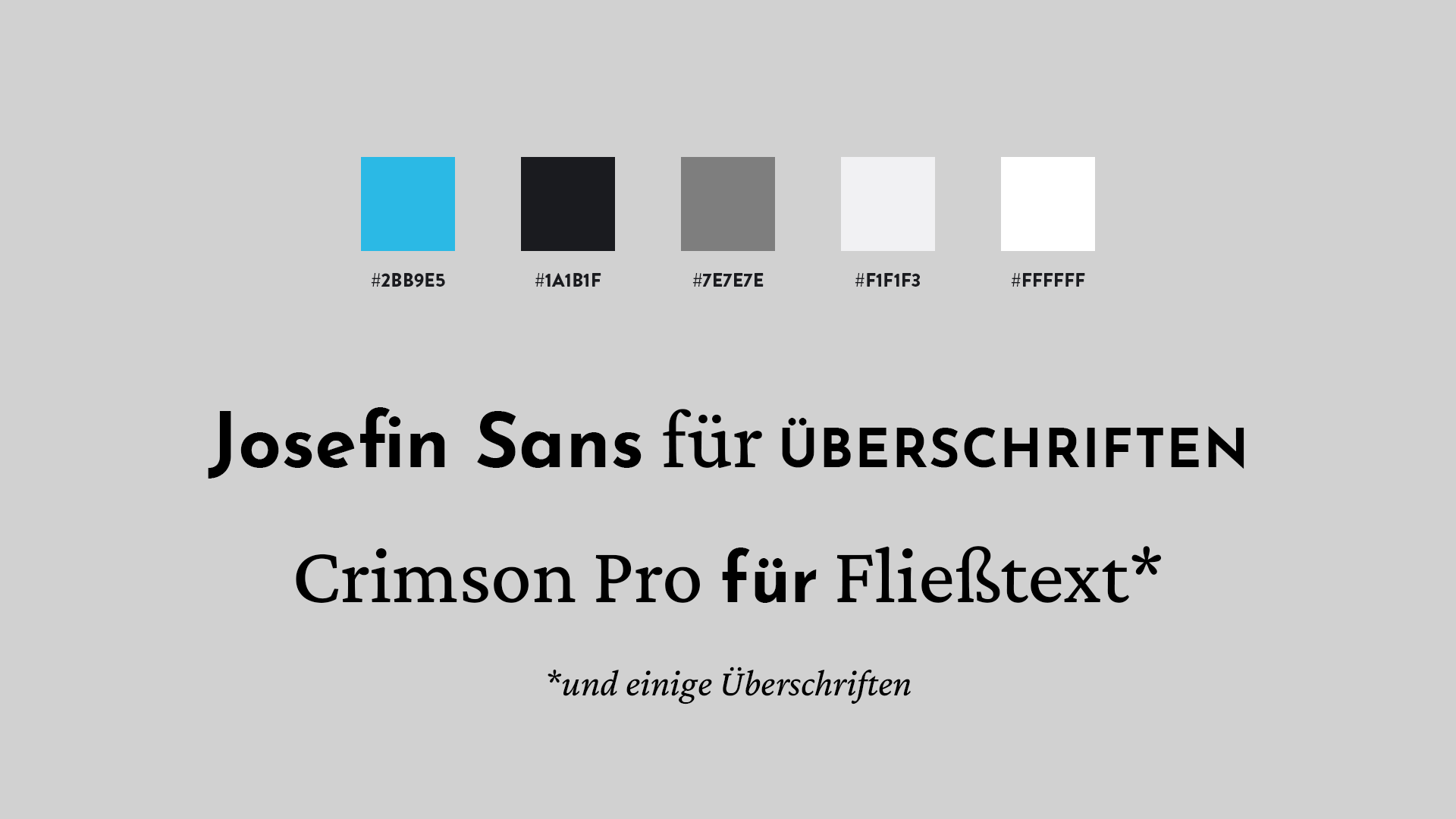
design card showing the fonts (Josefin Sans, Crimson Pro) and the color scheme of this website (white, black, greys, one blue)

The content


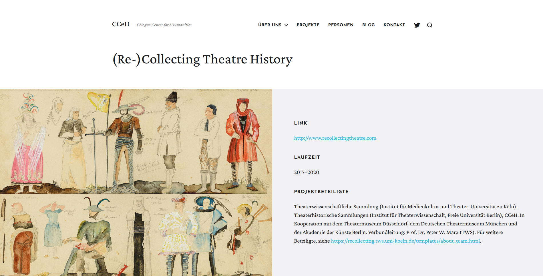
screenshot of the new CCeH website, example of a project page, in this case of the re-collecting theatre history project, 1 july 2021

Nice to Have

Before / After

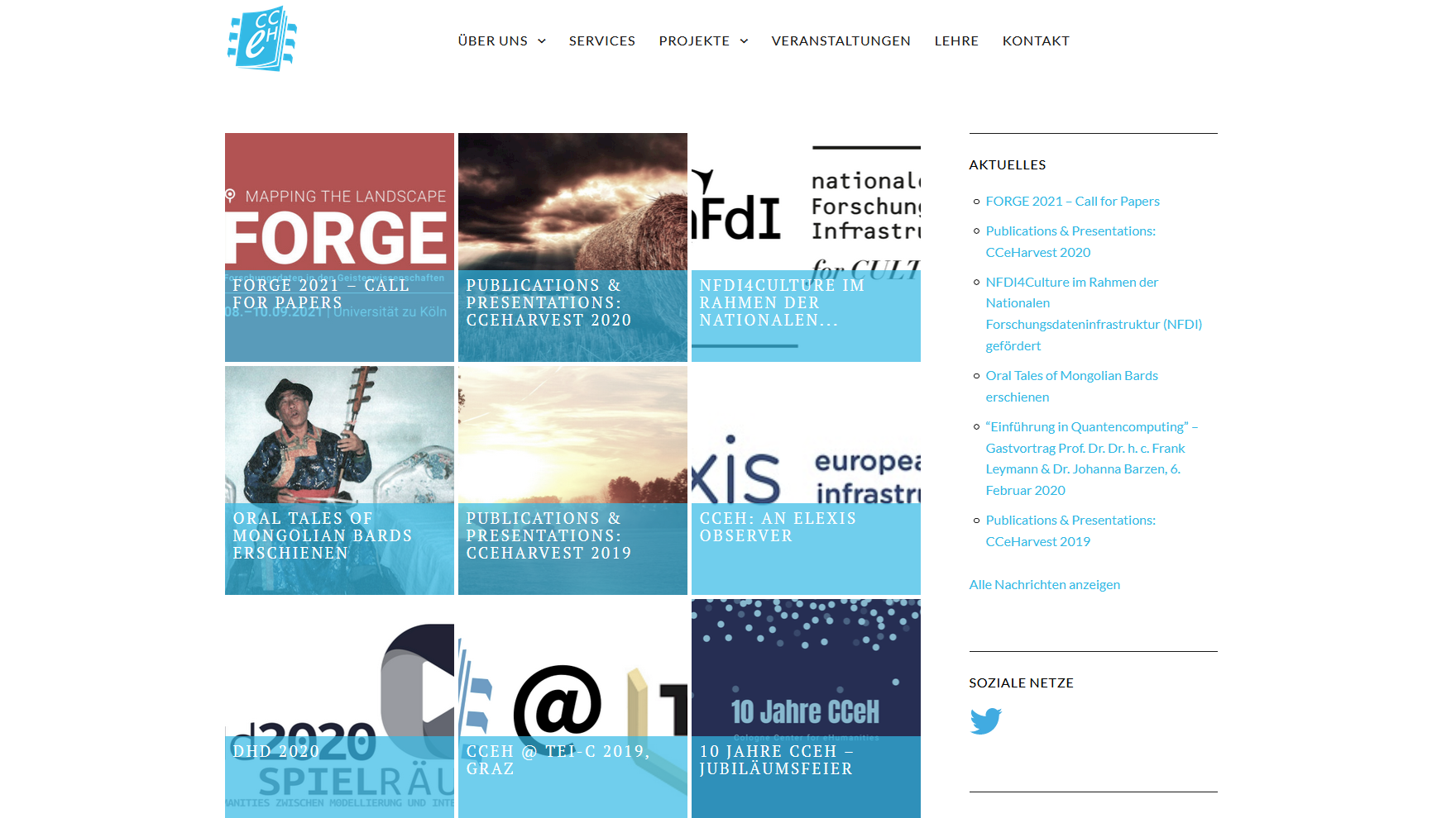
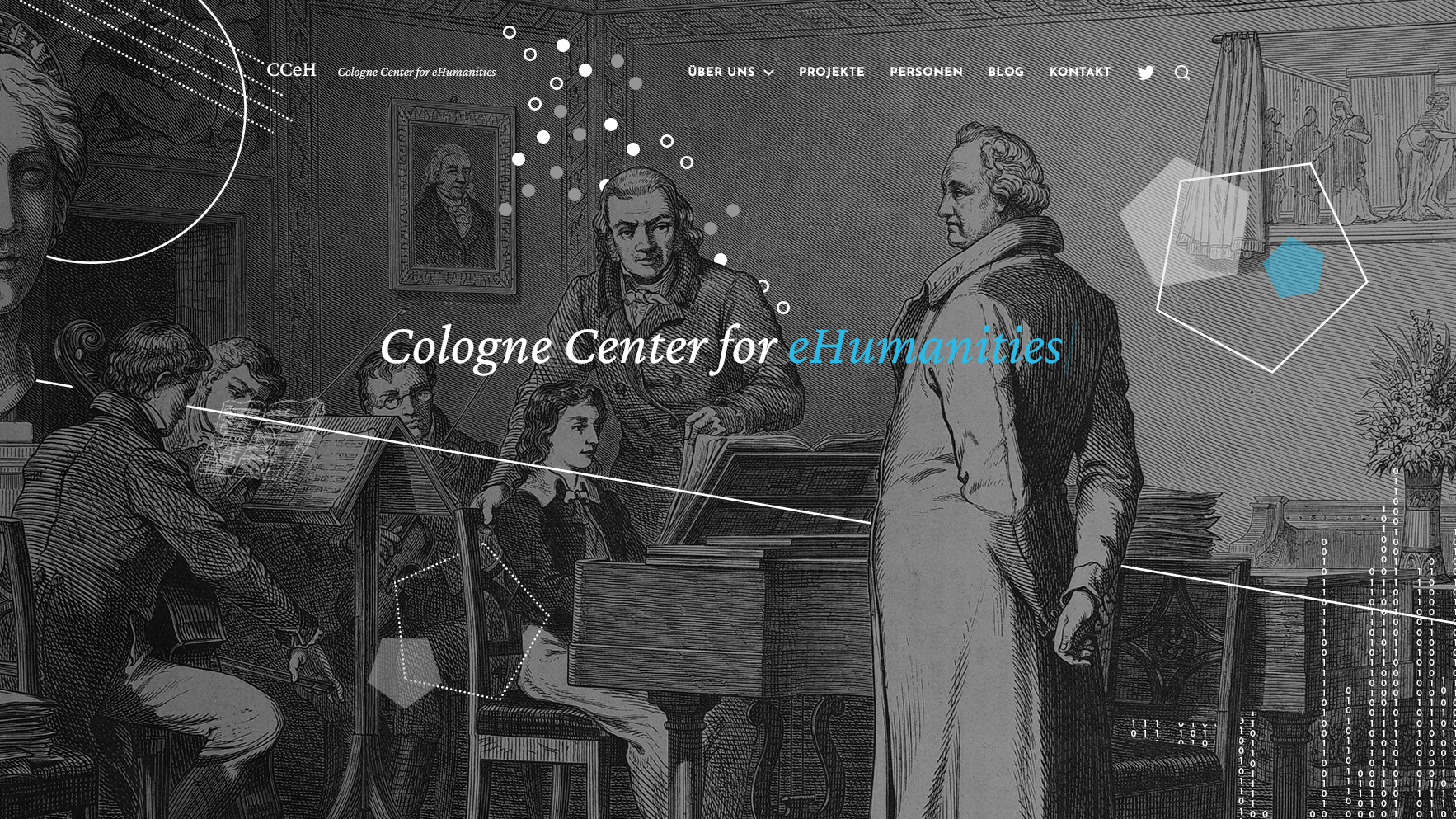
screenshot of the old CCeH website, homepage, 23 june 2021 screenshot of the new CCeH website, homepage, 1 july 2021
Drag
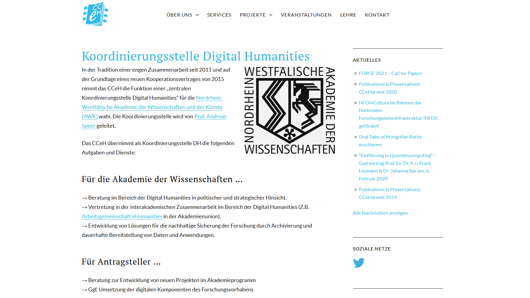
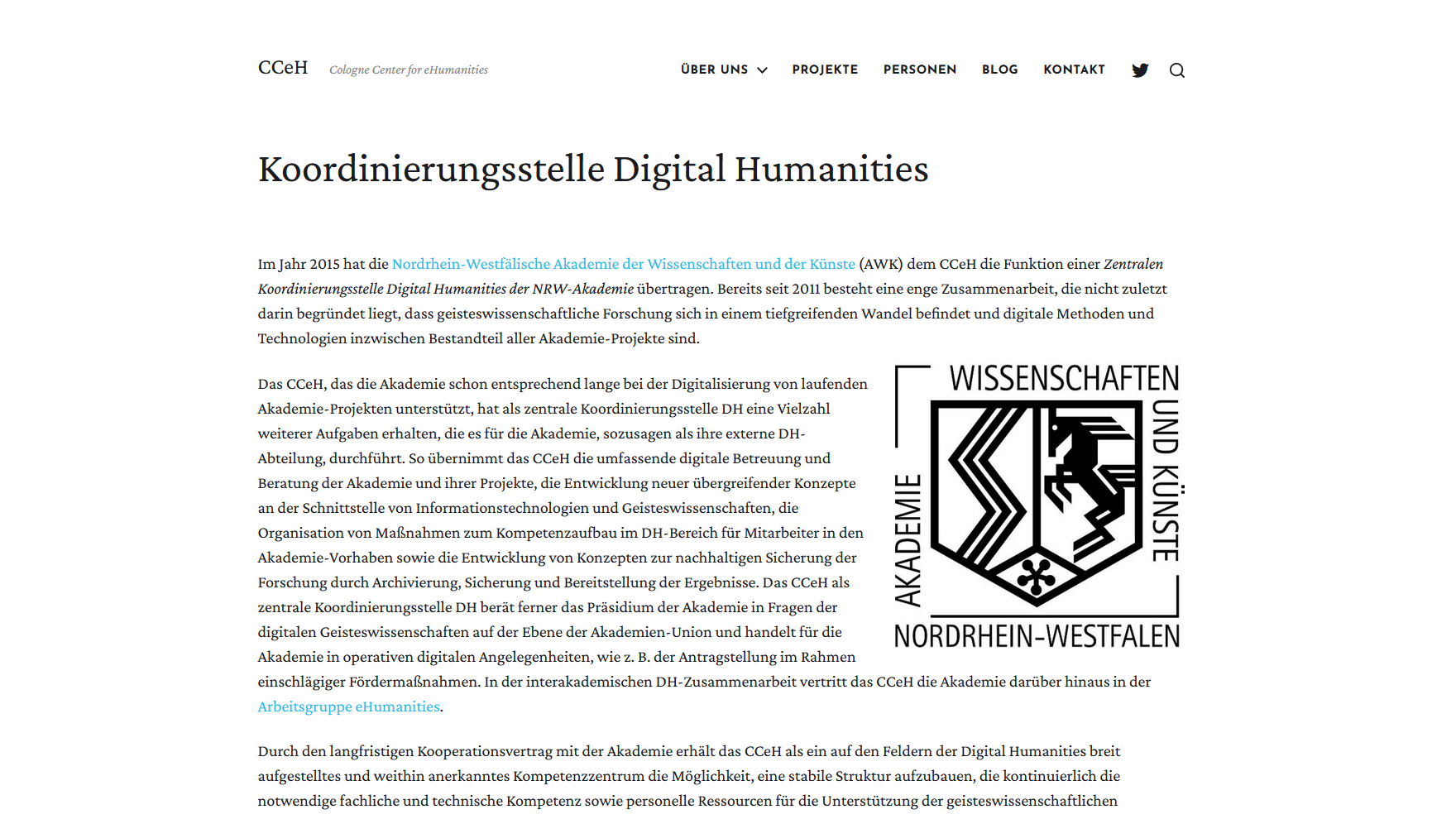
screenshot of the old CCeH website, page about the academy, 28 june 2021 screenshot of new CCeH website, page about the academy, 1 july 2021
Drag
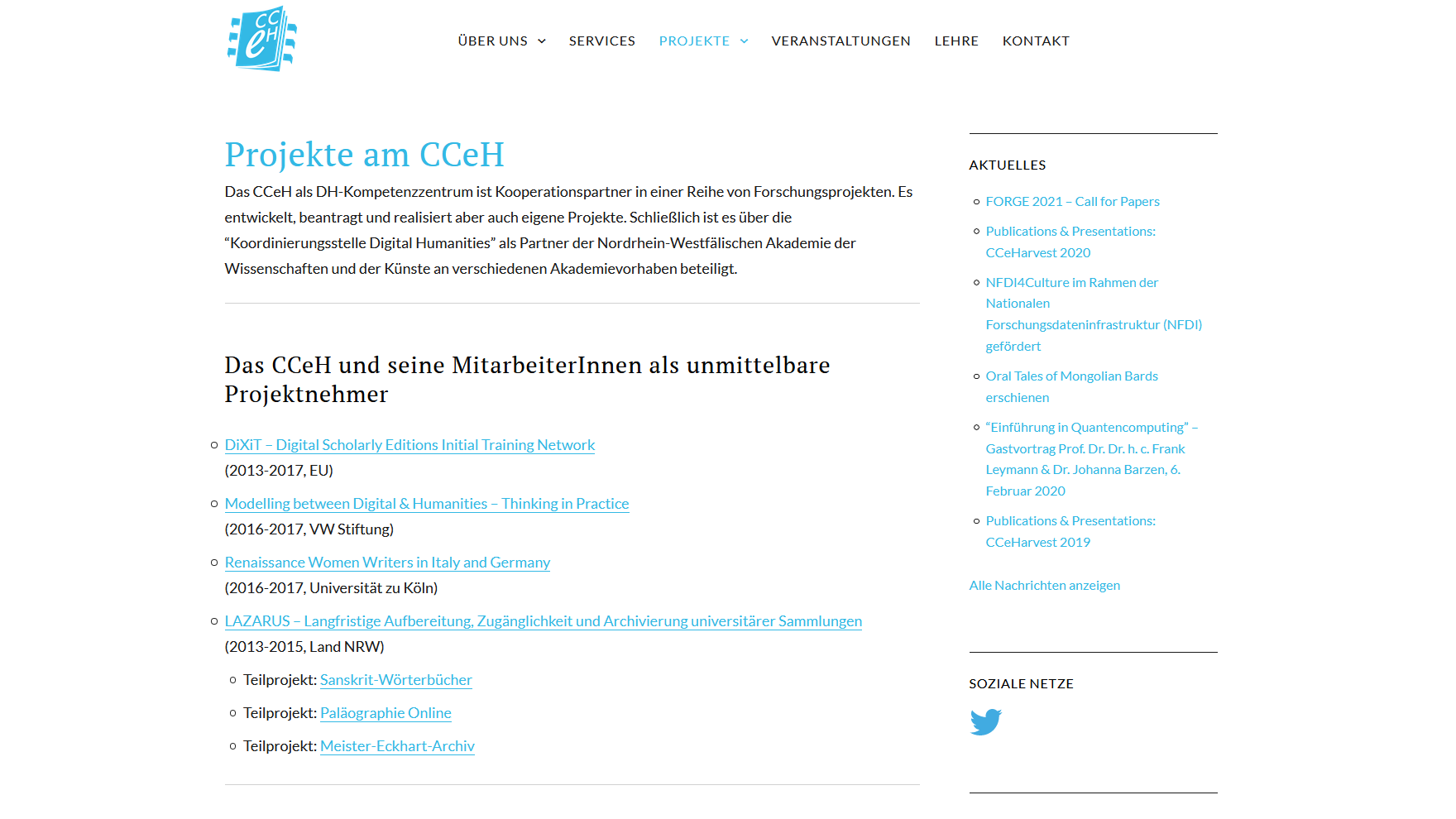
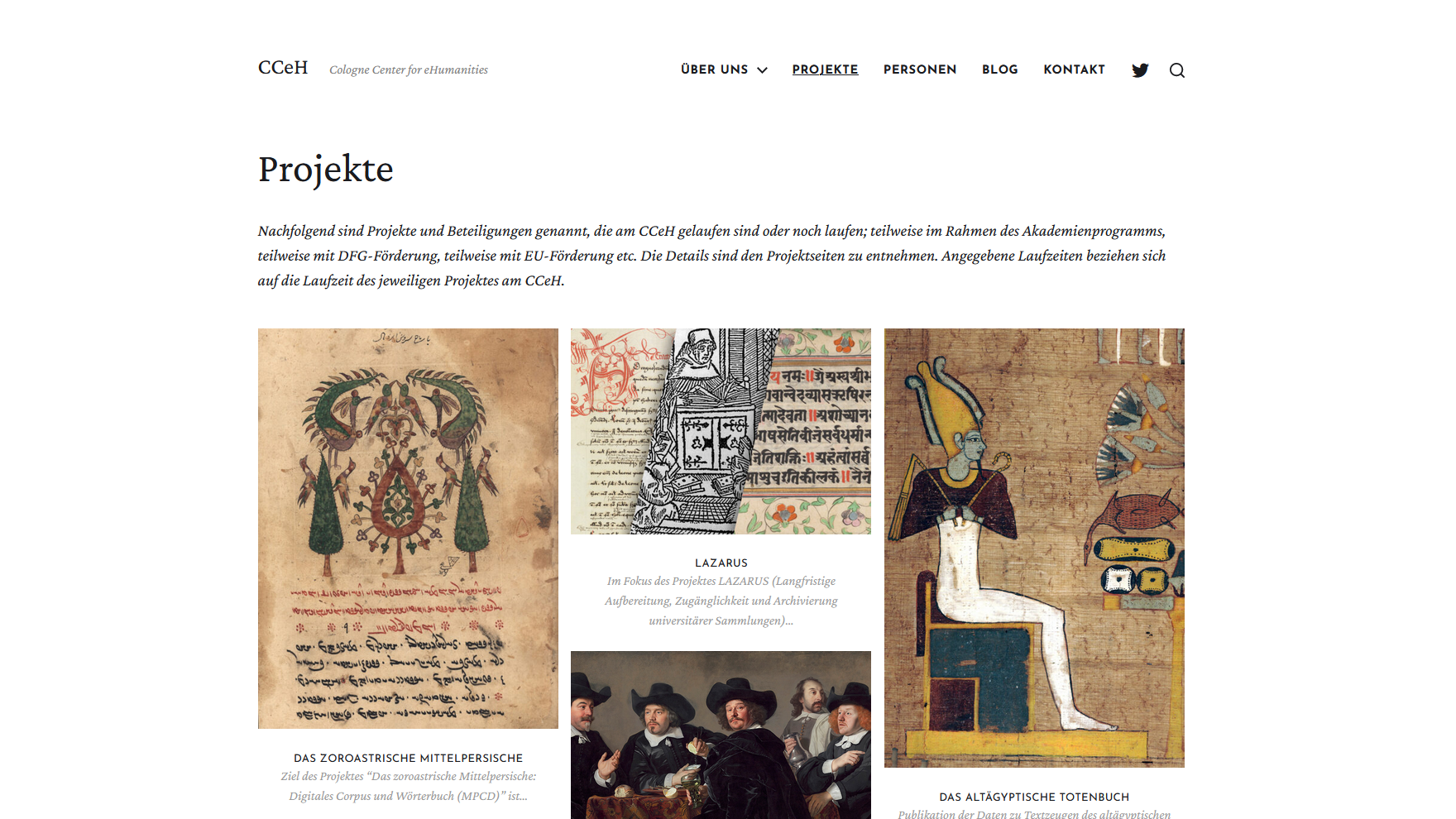
screenshot of the old CCeH website, projects list, 23 june 2021 screenshot of the new CCeH website, project portfolio, 1 july 2021
Drag
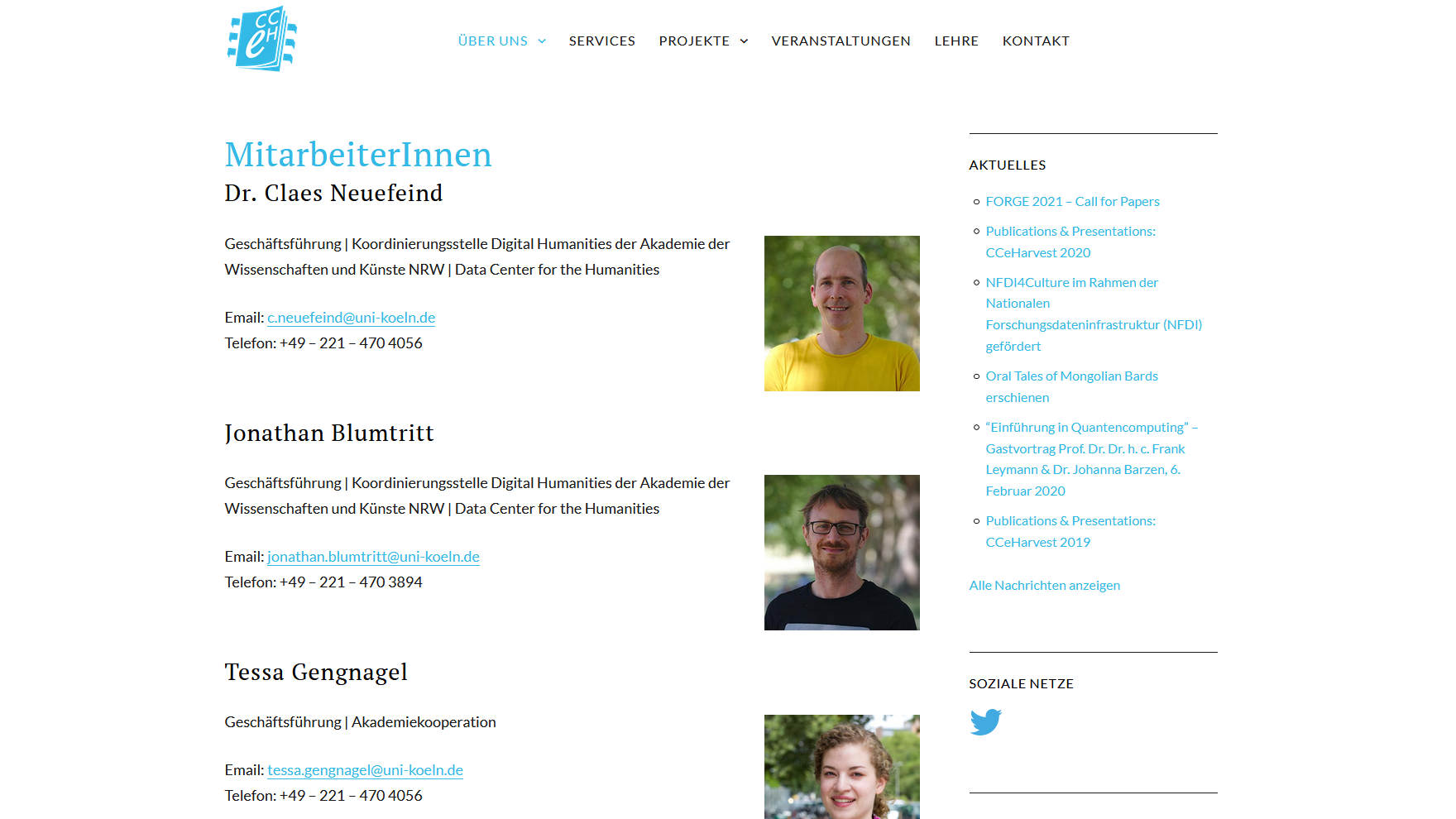
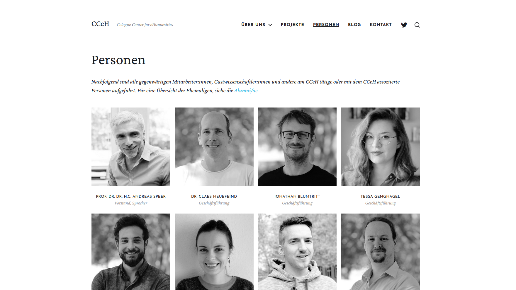
screenshot of the old CCeH website, team page, 23 june 2021 screenshot of the new CCeH website, team page, 1 july 2021
Drag