he time has come: after much deliberation, we have decided to redesign our website. It should be minimalist, highlight the essentials and at the same time convey a good impression of who we are and what we do. We wanted to base the design language on the previous website and stay true to its color scheme, but without missing the opportunity to overhaul aspects of the typography and imagery. In fact, we quickly came to the conclusion that a few occasional changes would not necessarily be effective in the long term, which is why we not only gutted the site, but completely redesigned it. New theme, new content, new happiness. In the following, we would like to document and comment on the most important considerations and changes.
The design
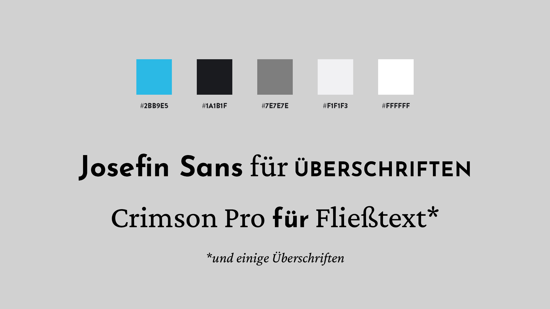
As mentioned, the color scheme with the blue accent color and the black font on a white background corresponds to the old color scheme, but has been expanded to include a few shades of gray. The typographical changes were more important than the color adjustments. Josefin Sans, a geometric sans serif, is used in the navigation menu and in some other headings and highlights. Its capitalized form in particular is reminiscent of other popular sans serifs such as Brandon Grotesque. Crimson Pro, a further development of Crimson which, like Crimson, is based on a classic Garamond, was chosen as the bread font for the body text. We also use Crimson Pro in some headlines, sometimes in its cursive form, because it cuts a fine figure there too. Well, at least that’s our opinion, as the broad field of typography demands its own expertise.
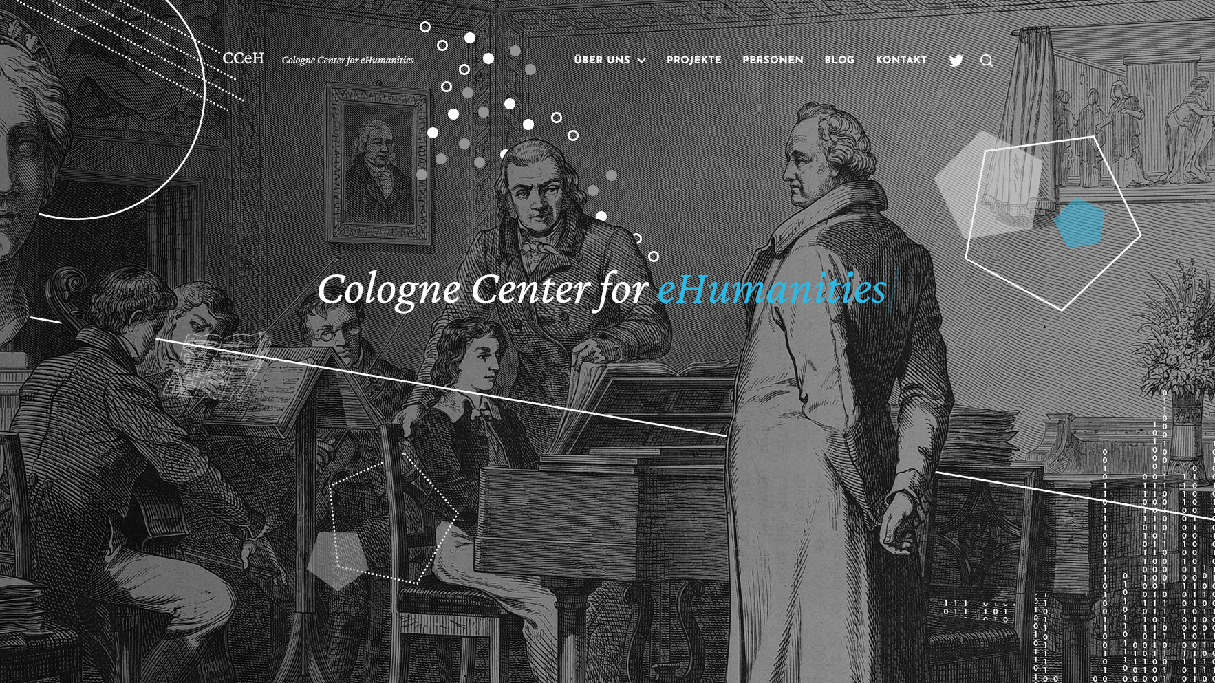
In addition to renewing the typeface, it was also important to us to ensure balanced page layouts overall. White space is generally underestimated as a design element – because the absence of content draws the eye to the content in the first place. For this reason, there is only one page-filling image on our homepage as a visual representation of the overarching framework in which the CCeH is embedded: the research field of (especially German-language) digital humanities. We have chosen a well-known historical scene for this, in which the young Felix Mendelssohn Bartholdy visits the ageing Johann Wolfgang von Goethe in Weimar in 1821 and plays him something on the piano, illustrated in the magazine The gazebo from 1867 and broken up by us through geometric artifacts that are intended to suggest a digital penetration of culture and cultural heritage; which at the same time raises questions about both the media surrogate and the connection of symbolisms that are part of the fundamental canon of discussion in the digital humanities.
_005.jpg)
The content
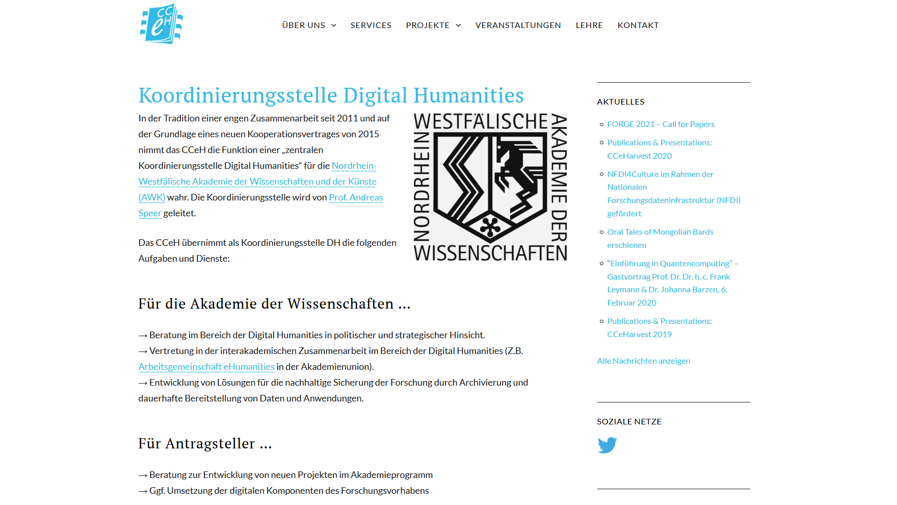
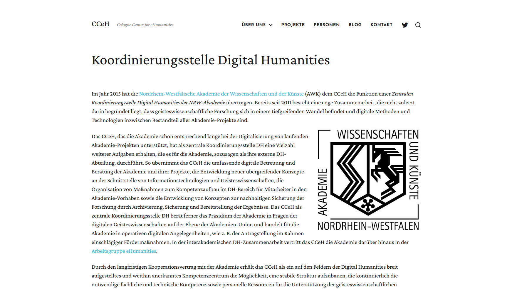
Content and design go hand in hand. The top priority was: minimalism, but well thought out. In terms of the number of pages and their structure, the trend on the new site was clearly towards streamlining. Teaching and events have been removed as separate menu items, but you will of course still be able to find information about our involvement or announcements in the blog. A more comprehensive overview of DH-related courses is provided each semester by the IDH. All other differences in the sitemap would be too confusing to describe, so the question should be simple: Is something missing from the new site? We believe (hope!) not. We are also still working on migrating some selected content from the older site to the new site.
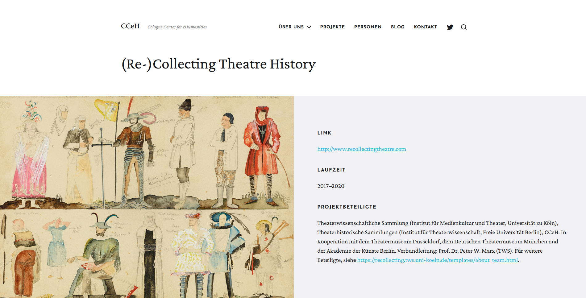
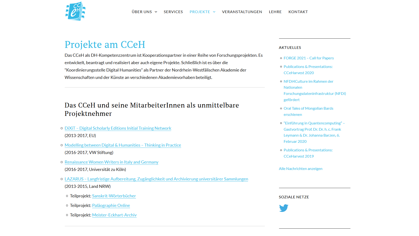
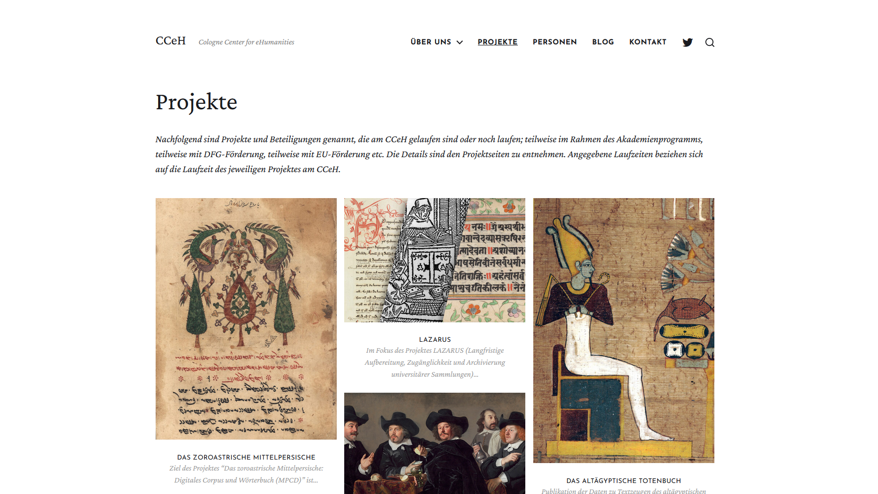
The changeover is therefore not a radical cutback. In fact, content has already been added. And not insignificant ones at that: Because there is now not only a new illustrated portfolio overview of the projects in which we as CCeH were once involved or are currently involved, but also separate project pages on which some central information is bundled in each case. And here, too, the connection between design and content is evident, as it was important to us to convey a better impression of the variety of materials in humanities research that we deal with through meaningfully integrated image content. Hopefully we will be forgiven if there are any latecomers after the re-launch – a lot has accumulated over the years.
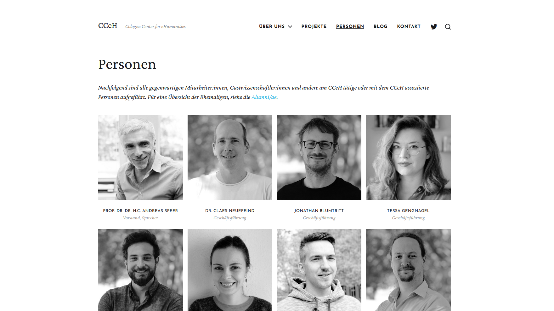
In addition to the project pages, there are now also profile pages for people who are involved in the CCeH, whether as active employees or associated scientists. We have made it optional for everyone to have their own page, which is why you will find one from some people and not from others. Contact information can be found for all active / associated persons either on the profile pages or in the alternative enlargement of the profile photo in the lightbox as a caption.
Nice to Have
It should not go unmentioned that there are some features that we would like to implement in the future. Two in particular are worth emphasizing here: Firstly, we would like to make the site bilingual (de/en) as soon as possible, and secondly, we are testing ways to improve the accessibility of the site. Basically, we paid attention to various aspects such as the use of alt attributes for images, contrast and responsive design. Nevertheless, we are aware that there is still room for improvement here and will continue to address this issue and take it into account when updating the site.
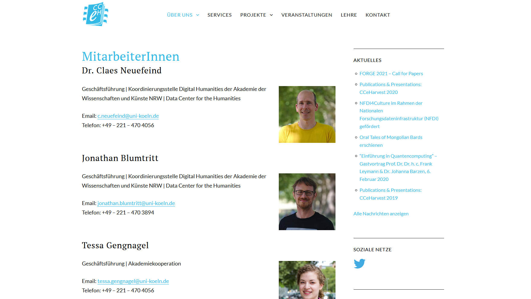
Before / After
Last but not least, we have put together some comparison images below. On the left-hand side you can see the appearance of the old website, on the right-hand side that of the new one. As you can see: Somehow related, partly similar, but very different as a result. And that’s how it should be with a redesign, after all.
[Final note: Tessa Gengnagel is responsible for the redesign of the site and the graphic design. If you have any questions or comments, please contact us directly].